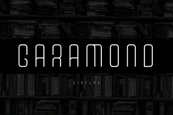
Vanhusin: A Futuristic Display Font That Elevates Digital Branding
It started with a hero section—just me, a fresh Figma file, and a client’s request for “something bold but not loud, modern but not cold.” I’d already tried three clean sans serifs, two elegant serifs, and one overly playful script. None landed quite right. Then I dropped Vanhusin into the headline—and suddenly the whole layout exhaled. The contrast between its sharp, expensive-looking characters and the soft, airy background image created instant visual gravity. Not just attention-grabbing, but *trust-building*. That’s when I knew this wasn’t just another display font—it was a strategic design asset.
What Makes Vanhusin Stand Out in Web Layouts
Vanhusin is a premium display font built for impact—not subtlety. Its letterforms carry a sleek, futuristic confidence: tight spacing, high contrast between thick and thin strokes, and subtle geometric precision that reads as both contemporary and intentional. It doesn’t try to be friendly or warm; instead, it communicates clarity, innovation, and considered craftsmanship. Think of it less as a workhorse typeface and more like a signature accent—ideal for moments where your brand needs to say, “This matters.”
I tested Vanhusin across real web contexts: a boutique online store’s banner, a coaching website’s value proposition headline, a course sales page’s CTA button, and a portfolio site’s project title cards. In every case, it held up beautifully—even at smaller sizes on mobile, thanks to its strong x-height and open counters. Unlike many decorative display fonts, Vanhusin avoids excessive ornamentation, so it renders crisply on screens without blurring or pixelation, even at 24px on a retina display.
Where Vanhusin Shines (and Where It Doesn’t)
Vanhusin excels in short-form, high-impact roles:
- Hero headlines — Especially over image banners or gradient overlays, where its bold presence anchors the composition.
- Section titles — Like “How It Works” or “Our Approach” on service pages—giving structure without shouting.
- CTA buttons — When paired with generous padding and ample whitespace, it adds sophistication to action-oriented text.
- Logo lockups — As part of a wordmark or standalone monogram, particularly for creative studios, tech-adjacent brands, or digital product launches.
- Digital brand kits — Used consistently for slide headers, social media cover graphics, and email newsletter subject lines.
That said, Vanhusin isn’t meant for body copy, navigation menus, form labels, or dense dashboard interfaces. Its personality is too strong for functional text—and its lack of extensive weights (it’s best used as a single bold weight) means it won’t support complex typographic hierarchies on its own. For accessibility and readability, always pair it with a highly legible sans serif—like Inter, Manrope, or even a neutral system font—for all supporting content.
Real Pairings That Work Seamlessly
Font pairing isn’t just aesthetic—it’s UX hygiene. With Vanhusin, I’ve found the most effective combinations follow a simple rule: contrast with clarity. Its futuristic edge pairs effortlessly with humanist sans serifs that ground the interface. On a recent landing page for a design tools newsletter, I used Vanhusin for the headline (“Build Smarter Interfaces”) and Inter for everything else—including subheads, bullet points, and form fields. The result felt editorial, trustworthy, and fast-loading.
For a more refined, editorial tone—say, a blog redesign for a sustainability consultant—I swapped in a gentle serif like Lora for body text. Vanhusin handled the post titles and category badges while Lora carried long-form reading with grace. Crucially, both fonts shared similar x-heights and optical balance, so the switch never jarred the eye.
If you’re using Vanhusin in SVG icons, logo mockups, or branded illustrations, check whether the font includes OpenType features like stylistic alternates or ligatures. While not essential for web use, these extras add polish in exported assets—and help maintain brand consistency across digital and print touchpoints.
Practical Considerations Before You Deploy
Before dropping Vanhusin into production, I always verify four things:
- Webfont availability — Confirm the vendor provides WOFF2 files (smallest, fastest) and CSS snippets optimized for modern browsers.
- Licensing scope — Ensure your commercial license covers web embedding, client projects, SaaS platforms, and any third-party tools you use (like Webflow or Shopify themes).
- Character set coverage — Vanhusin supports Latin-based languages well, but double-check if you need extended diacritics, currency symbols, or math operators for your audience.
- Performance impact — At ~45KB uncompressed, it’s lightweight—but always preload critical display fonts and consider `font-display: swap` for graceful fallbacks.
I also test responsiveness early: does Vanhusin scale cleanly from desktop down to 375px? Does it remain legible against dark mode backgrounds? In my tests, yes—but only when used at 28px minimum on mobile hero sections, with line-height adjusted to 1.1 for tighter rhythm.
Why Vanhusin Fits Today’s Digital Branding Needs
In an era where users scroll past dozens of websites before pausing, first impressions are typography-first impressions. Vanhusin doesn’t blend in—and that’s its strength. It gives digital spaces a distinct voice without sacrificing usability. Whether you’re launching a new product, refining a portfolio, or building a course sales page, Vanhusin helps your message land with intention and polish.
It’s not flashy for flashiness’ sake. It’s confident, controlled, and quietly luxurious—the kind of display font that makes visitors pause, read, and remember—not because it shouts, but because it speaks with authority.