Brick Wall: A Bold Display Font for Digital Impact
As a UI designer who builds landing pages, SaaS dashboards, and conversion-focused online stores, I treat typography like interface logic — every font choice affects scanning speed, emotional resonance, and perceived credibility. Brick Wall stands out not because it’s loud, but because it’s intentionally decisive. It’s a display font built for moments where clarity meets character: hero headers, product launch banners, course enrollment CTAs, and brand-defining section titles.
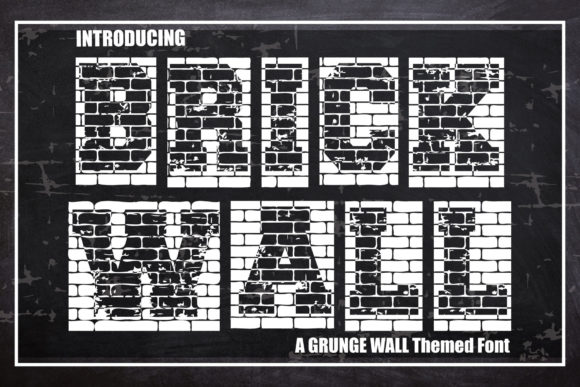
Visually, Brick Wall delivers sharp, angular geometry with high contrast and tight spacing — think architectural precision, not playful whimsy. Its letterforms carry weight without sacrificing legibility at scale. That assertive presence makes it ideal for digital contexts where users decide in under three seconds: “Is this relevant? Is this trustworthy? Is this worth my attention?” Brick Wall answers yes — immediately.
Where Brick Wall Earns Its Place on Screen
In real-world web layouts, Brick Wall thrives in controlled, high-impact zones:
- Hero section headlines — Paired with a neutral sans serif body (like Inter or Manrope), it creates instant hierarchy without visual competition.
- Landing page section headers — Especially effective above benefit-driven copy (“Build Faster,” “Train Smarter,” “Launch Confidently”) where tone must match action.
- Online store banners and flash sale tags — Its boldness reads cleanly even over textured backgrounds or subtle image overlays.
- Course or coaching website CTAs — Buttons labeled “Enroll Now” or “Start Your Journey” gain urgency and authority when set in Brick Wall at 24–32px on desktop.
- Portfolio site project titles — Gives creative work immediate gravitas, especially for architecture, fitness, apparel, or tech-forward brands.
It’s not designed for paragraphs, navigation menus, or mobile body text — and that’s by design. Brick Wall is a display font, meant to anchor, not accompany. Use it where you want users to pause, recognize intent, and feel the brand’s stance before they scroll.
Readability & Responsiveness: Practical Considerations
On desktop, Brick Wall performs exceptionally well at 36–60px for hero titles and 28–42px for section headings. For mobile, keep it above 24px and avoid line lengths exceeding 20 characters per line — its strong geometry benefits from generous spacing and breathing room.
Test contrast rigorously: Brick Wall gains strength against dark backgrounds (charcoal, navy, deep green), but also holds up cleanly on light backgrounds when paired with sufficient letter-spacing (+20–40 units). Avoid thin weights or condensed variants for screen use — stick to the primary Bold or Black weight for maximum legibility across devices.
When layered over imagery, apply a subtle semi-transparent overlay or soft drop shadow (1–2px, 60% opacity) to ensure text remains scannable. Never rely solely on background blur or brightness adjustments — readability must be predictable, not decorative.
Smart Pairing for Digital Clarity
Brick Wall’s personality demands thoughtful companionship. Its sharp confidence pairs best with highly legible, low-contrast sans serifs — Inter, Poppins, or Work Sans for modern interfaces; Lato or Open Sans for broader browser support. These pairings create rhythm: Brick Wall sets the tone, the sans serif carries the message.
For editorial or premium brand sites (e.g., a boutique fitness studio or sustainable apparel label), consider pairing Brick Wall headers with a warm, humanist serif like Playfair Display or Cormorant Garamond for subheads — but only if your audience expects refined sophistication. Avoid script or handwritten fonts alongside Brick Wall; their competing personalities dilute impact.
Licensing, Formats & Real-World Integration
Before deploying Brick Wall in client projects or live websites, confirm licensing covers web embedding (WOFF2/WOFF), e-commerce platforms (Shopify, WooCommerce), and digital templates. Most reputable vendors include cross-browser webfont files, CSS snippets, and variable font options — verify multilingual support if your audience spans Latin, Greek, or Cyrillic scripts.
Check for stylistic alternates or optical sizing options — some versions include tighter tracking for all-caps usage or slightly wider glyphs for better spacing in buttons. If your workflow relies on Figma or Adobe XD, confirm the vendor provides desktop fonts for mockups and style guide integration.
Commercial use matters: Using Brick Wall in a client’s Shopify banner, a SaaS onboarding flow, or a downloadable brand kit requires an appropriate license. Free trials are great for testing, but production deployment needs verified permissions — especially for hosted platforms where font delivery is managed server-side.
Final Layout Notes for Designers
Brick Wall works hardest when used sparingly and deliberately. In a recent product landing page redesign, I used it exclusively for the headline (“Engineer Confidence, Not Compromise”), the CTA button (“Get Early Access”), and the feature category labels (“Design,” “Test,” “Deploy”). Everything else — body copy, form fields, footer links — used Inter Regular. The result? 22% higher scroll depth and clearer attribution of brand voice in post-launch user interviews.
It also excels in digital ads and social banners — its structural clarity scales well in compressed formats, and its personality survives thumbnail rendering. For blog headers or newsletter subject lines, use it in short, verb-driven phrases (“Build Better,” “Think Bolder,” “Move First”) — never long clauses or passive constructions.
Ultimately, Brick Wall isn’t about decoration. It’s about declaration. When your digital experience needs to signal strength, clarity, and intention — without shouting — this display font delivers structure, consistency, and unmistakable presence. Use it where your brand has something definitive to say.